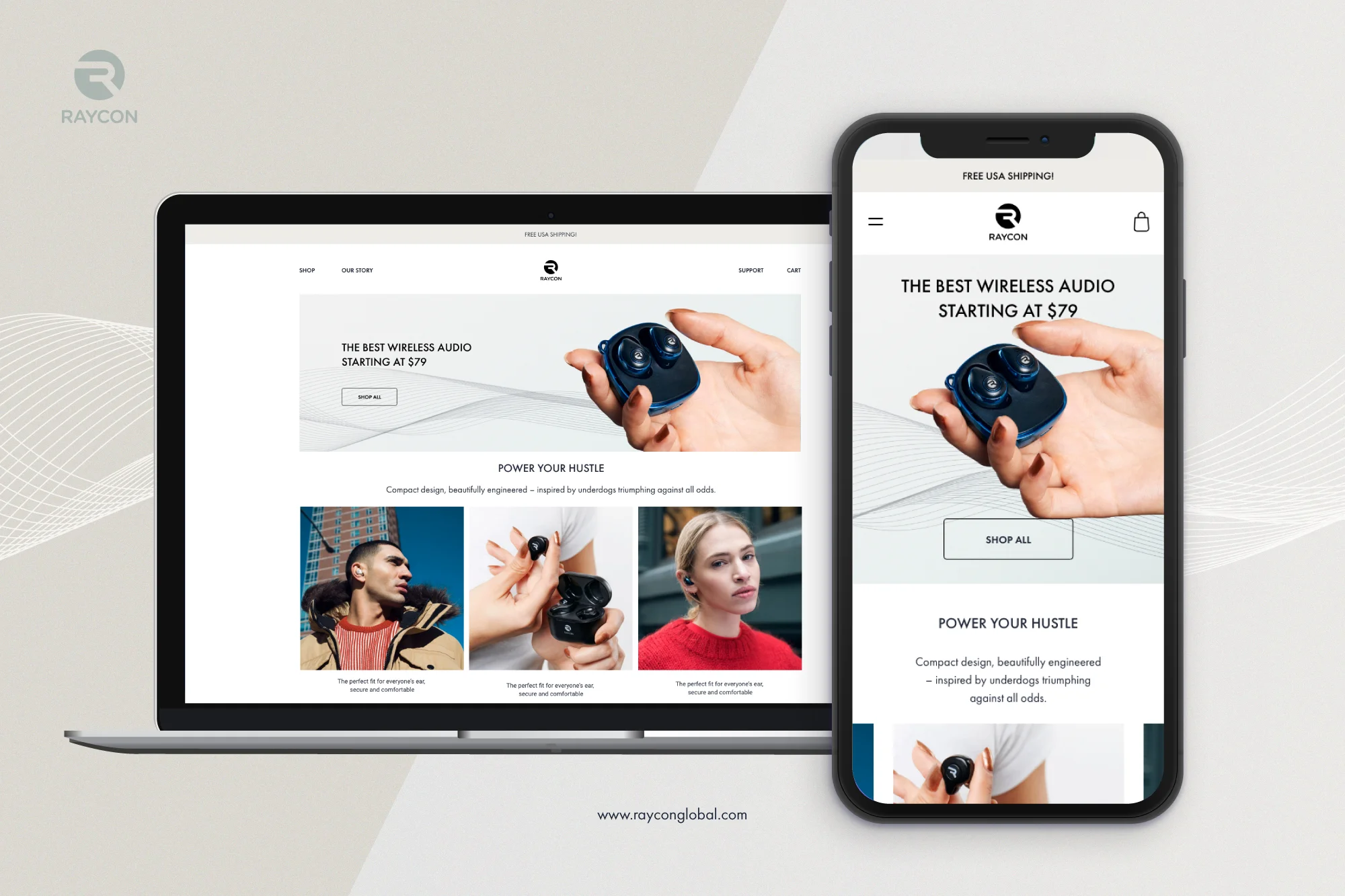
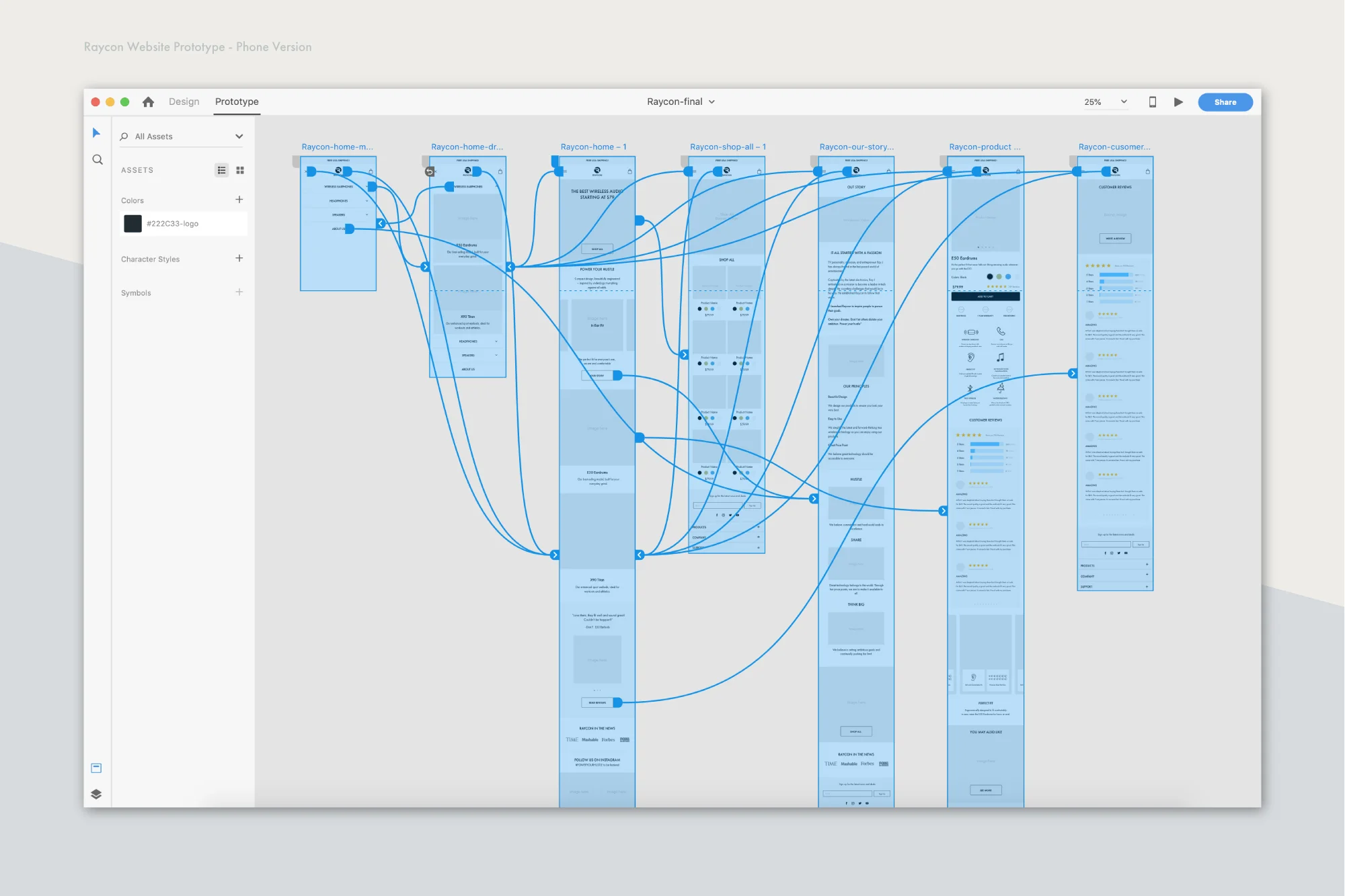
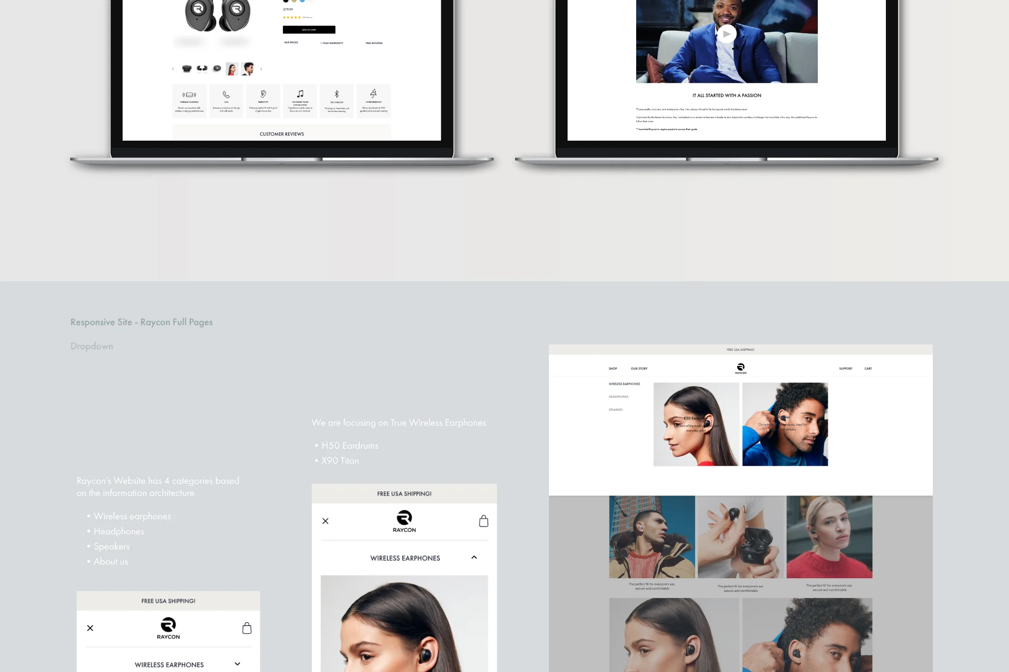
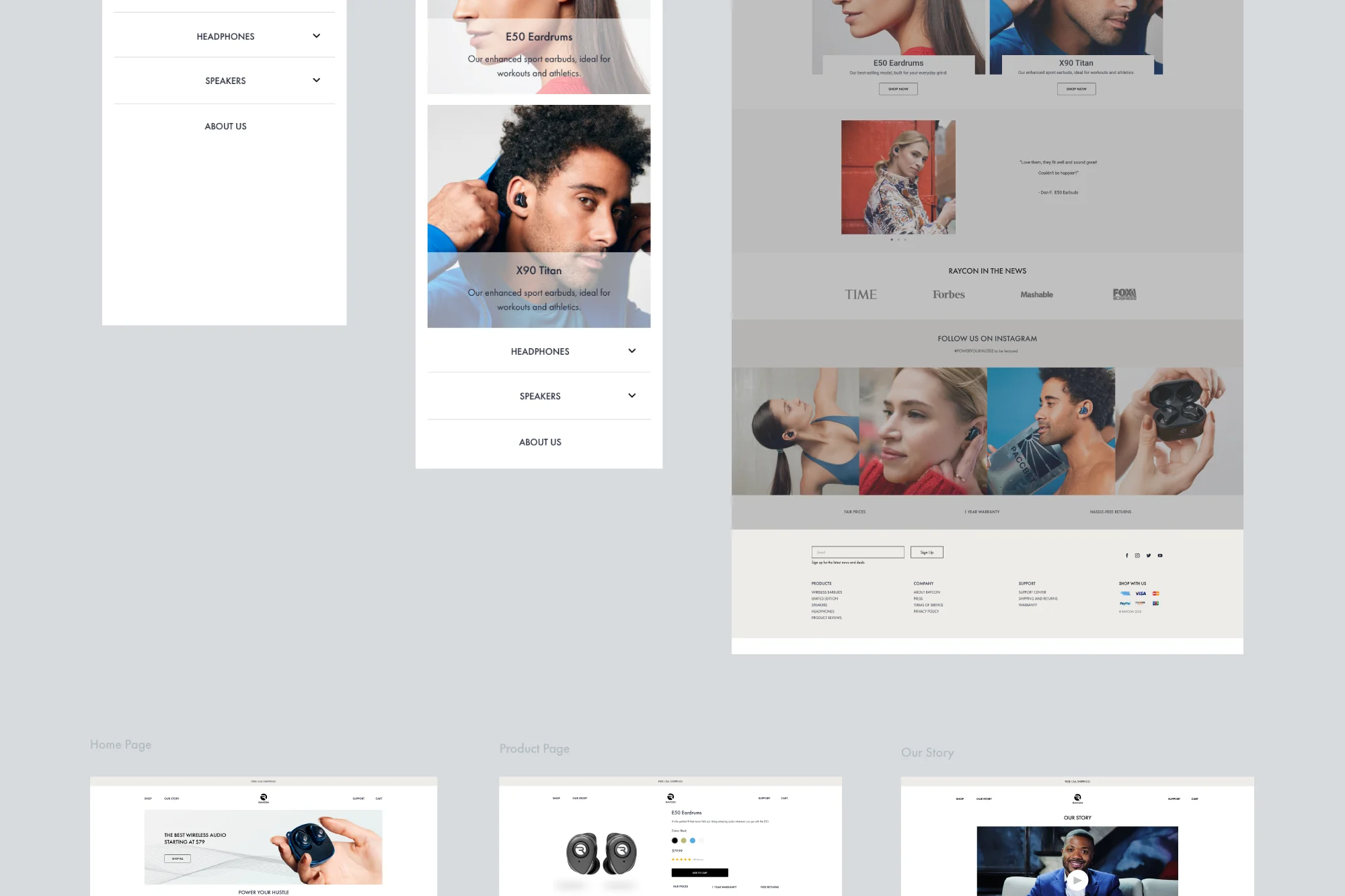
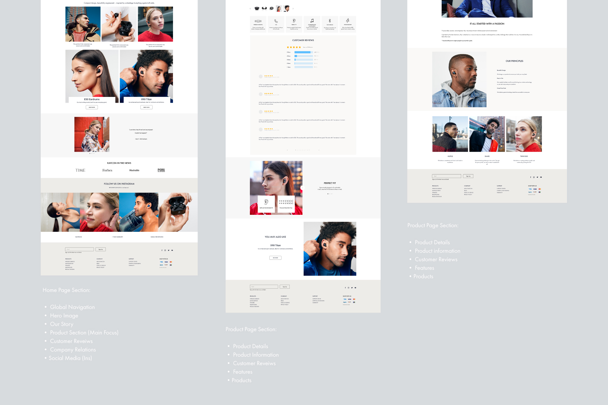
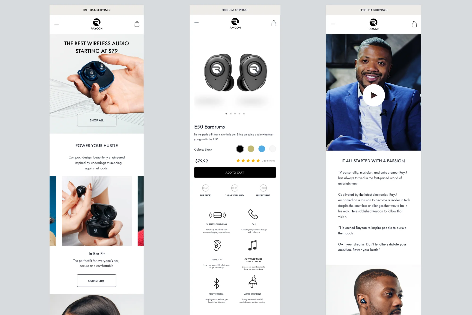
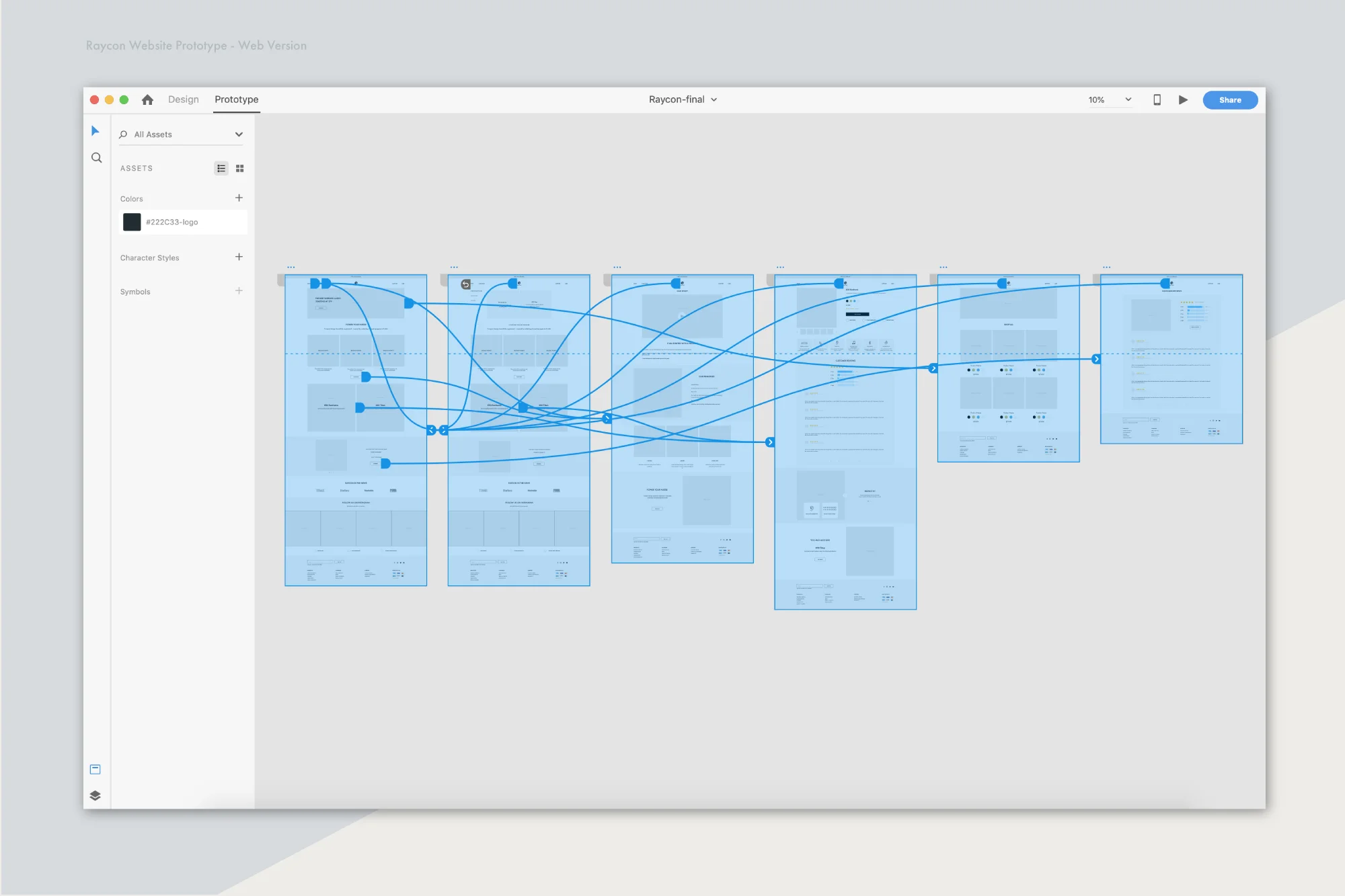
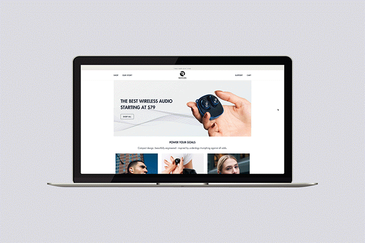
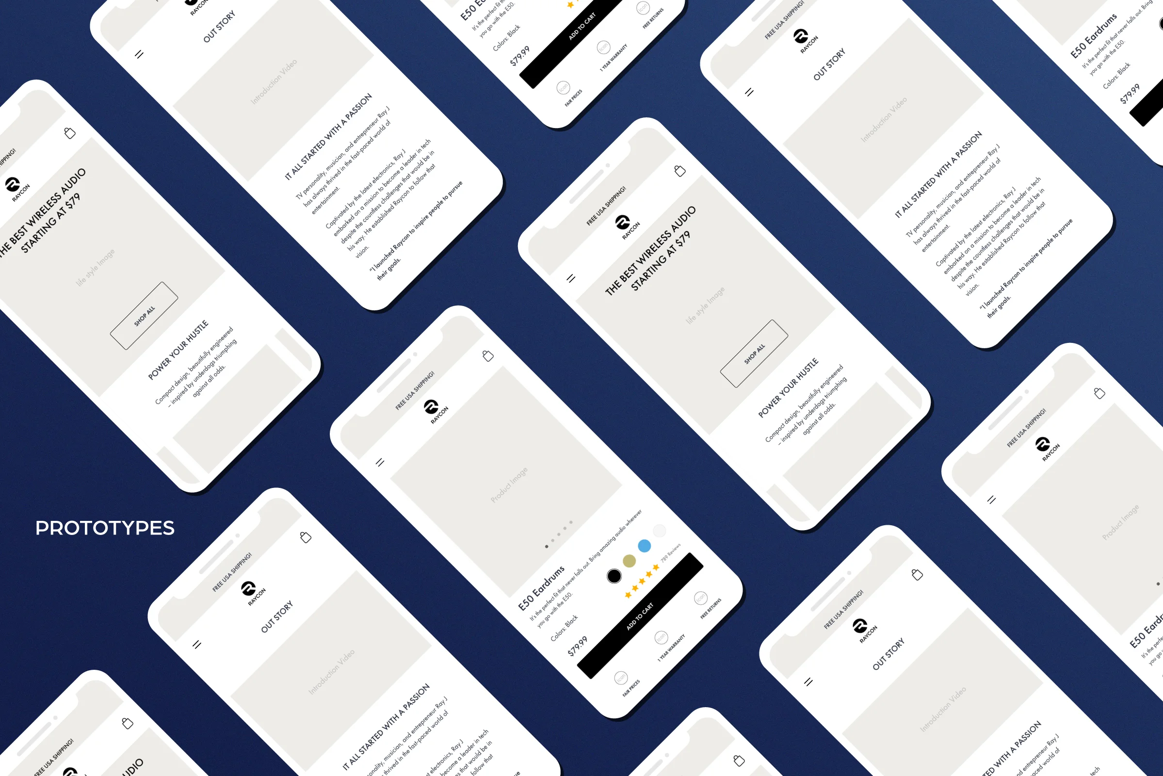
Raycon saw major success after we redesigned our official website at the end of 2018, and opened up more ad channels. We are proud of our new website flow and structure; it took many A/B testing cycles and design iterations to get it right. My role was to create the visual experience, which involved optimizing versions for different screen sizes and implementing UX ideas based on sales and user data analysis. It’s important to understand the differences, opportunities, and limitations of each platform type.
POWER YOUR GOALS
Our business goal is clear - Compact design, beautifully engineered – inspired by underdogs triumphing against all odds.
The strategic reason we opted to redesign the website was based on our careful analysis of customer and user data across all platforms. I am not able to share specific internal company data in my portfolio, but the following steps were taken after that analysis.
PROJECT BRIEF
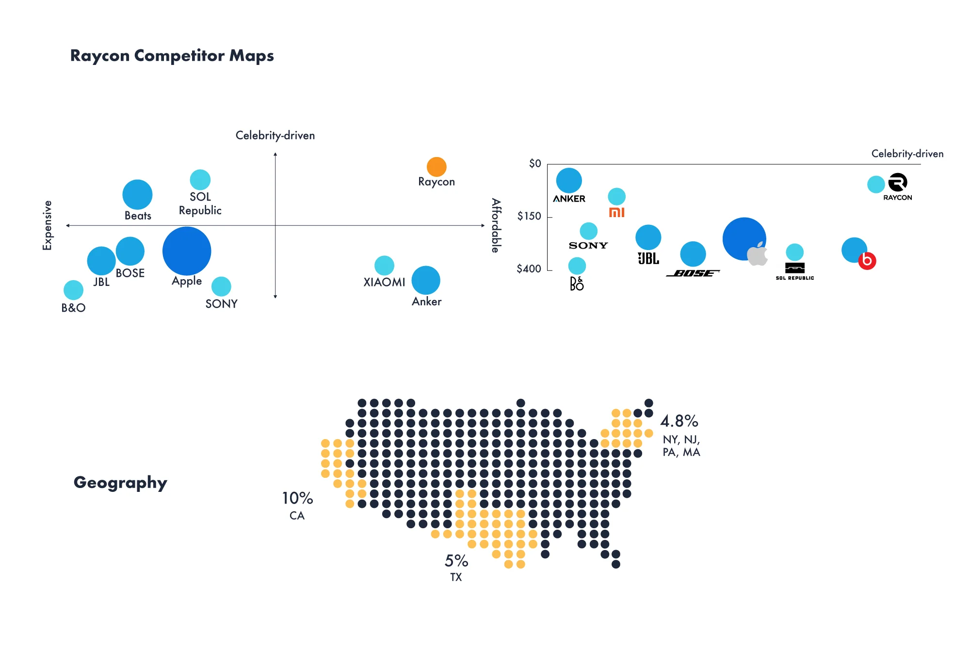
Raycon global is an electronics retail startup that's looking to shake up the industry and make buying easy. Intuitive sections and affordable pricing with celebrity-driven products excites customers and keeps them coming back. Raycon Global launched in November of 2018.
Understand where users come from and what they expect.
When people come in from Podcasts, FuelX, Pinterest, LiveIntent, affiliates, etc., they need to know:
• What our USP is? (unique selling point)
• Newness and freshness
• That we are trustworthy (customer reviews and social proof)
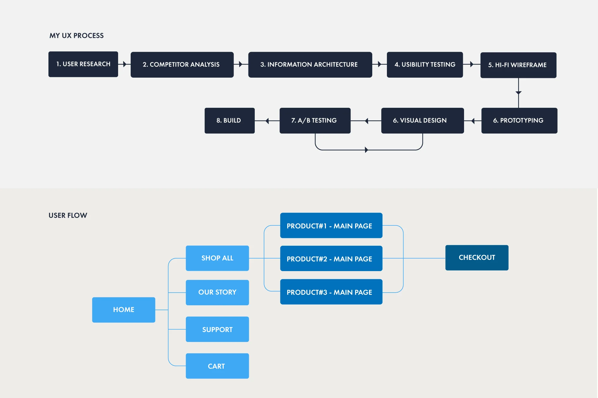
PROCESS
I wanted to see how people would use Raycon Global as opposed to other e-commerce sites (such as Allbirds, Evelane, Harry’s, Brookeline), so I gathered a few people of various online shopping habits and did user interviews with each.
I had each user perform the same task: add 1 item they would be interested in buying to their cart and finish the payment. I carefully observed their behavior and asked them to speak aloud as they went. I took notes on a few different areas.
Task Completion
Information Architecture
Content & Terminology
Communication & Impression
Visual / Layout Design
Define the problem:
The behavioral data came from our high frequency questions from the CS Team and interviewees.
Painpoints
• Too many product categories (Cognitive overload): Users don’t know what is the best unique product that Raycon is trying to sell.
• Inconsistent UI: Doesn’t seems like a branded website.
• There is no reviews section to reference.
• Cool product but is it worth it?
RESULTS
Some of the key takeaways and data found through the user testing:
What’s unique about the product?
All of the users were trying to look for the price, as the marketing strategy announced clearly that we have affordable prices.
The website doesn't immediately read as e-commerce.
All of the users agreed that the website didn’t strike them as an e-commerce site, especially at�first glance. They got the idea after using the site for a bit, but this could be problematic for new users. There was nothing to entice users to buy anything or explore the website until I had asked them to begin.
Users weren’t patient enough to read all product features.
Too many product animations decreased loading times. They left.
Limited (small) product selection.
One of the biggest issues was the inability for all of the users to find exactly what they were looking for. Most complained about Raycon not having a reviews section. Even when just browsing, most were unsatisfied about the lack of options to choose from.
PROPOSED SOLUTIONS
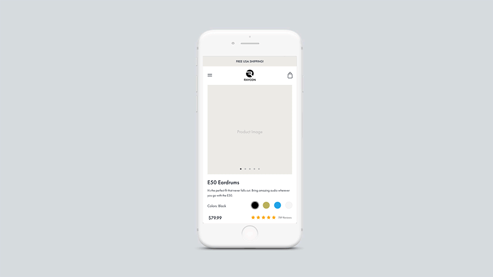
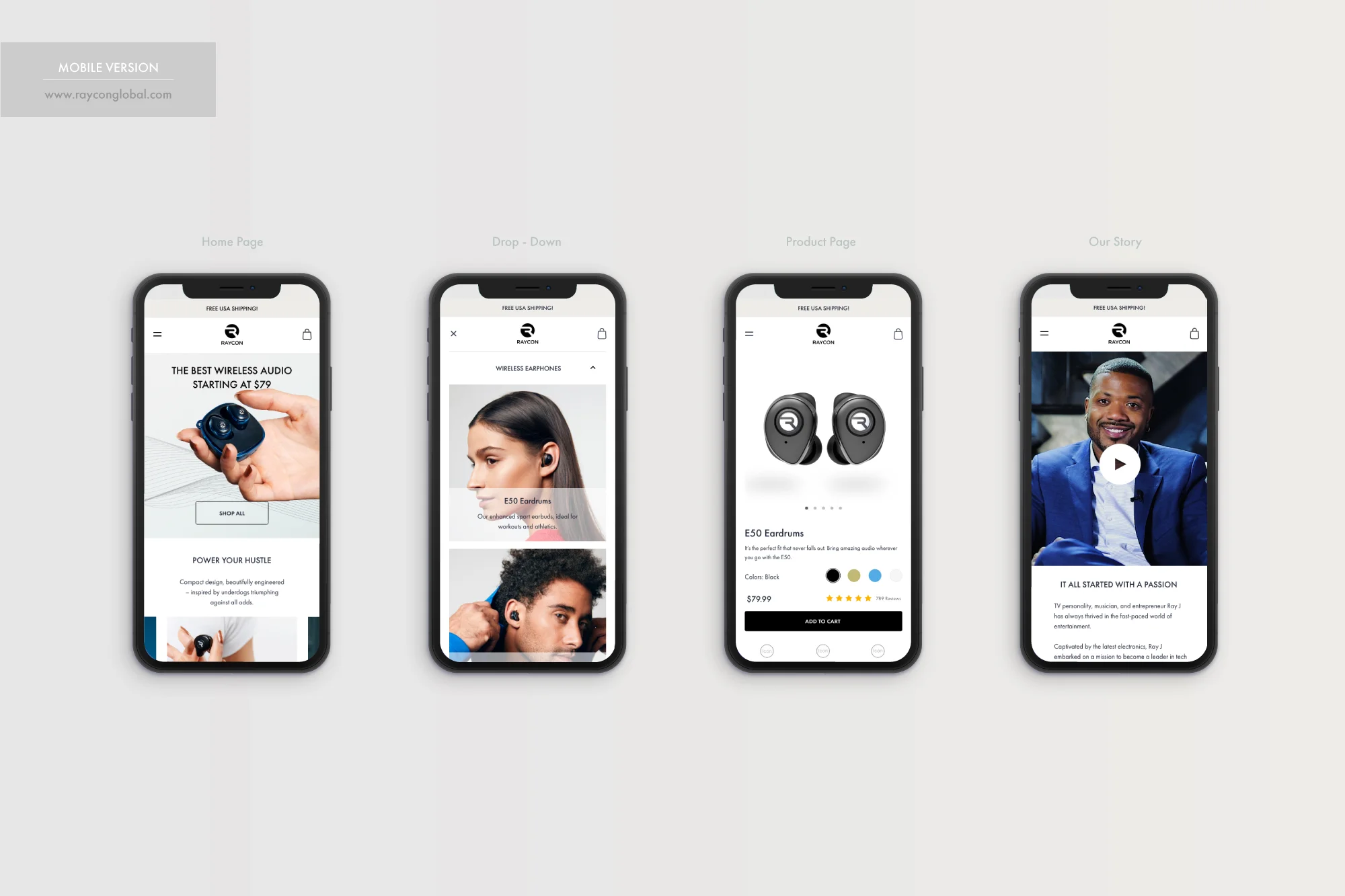
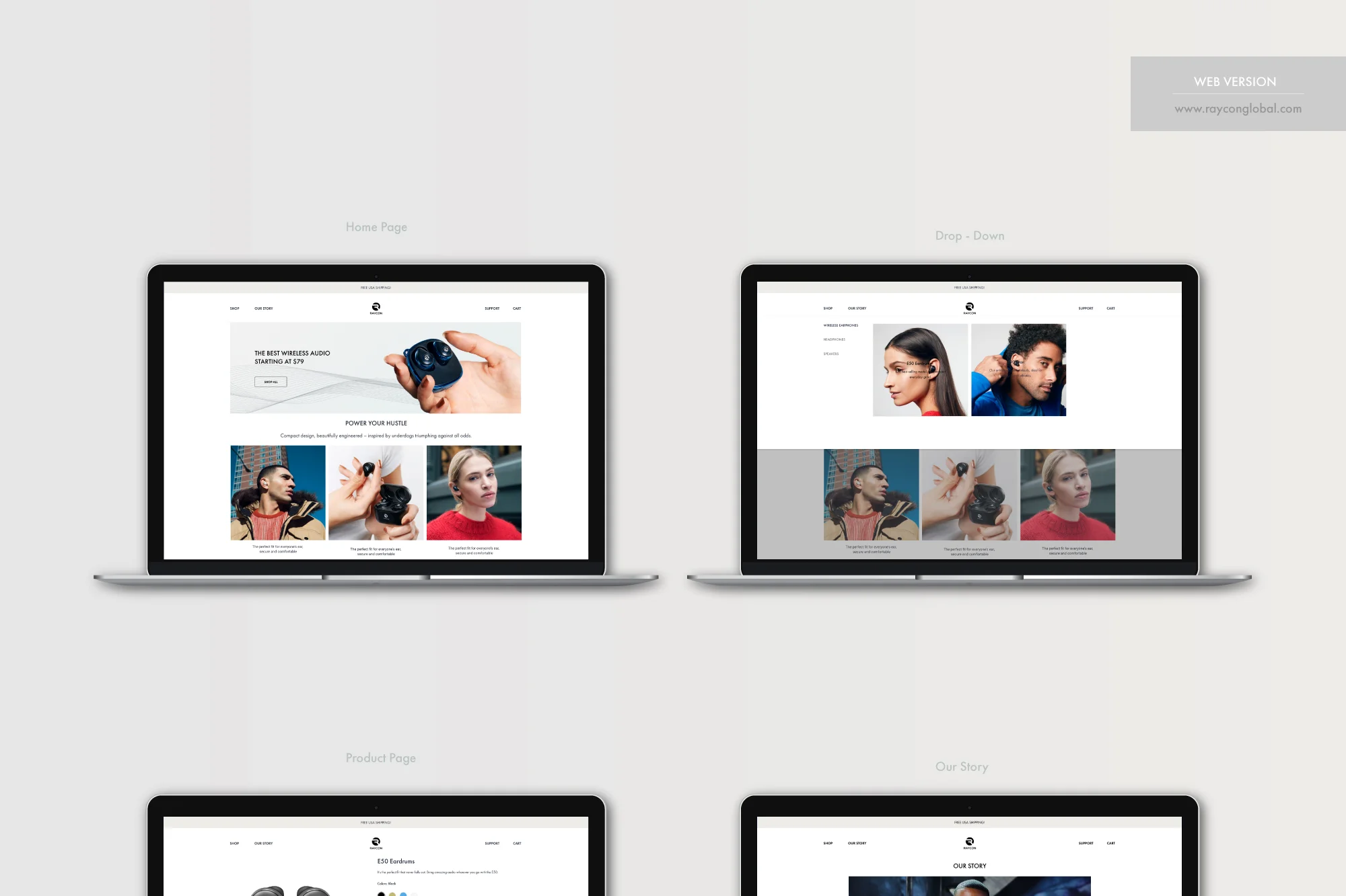
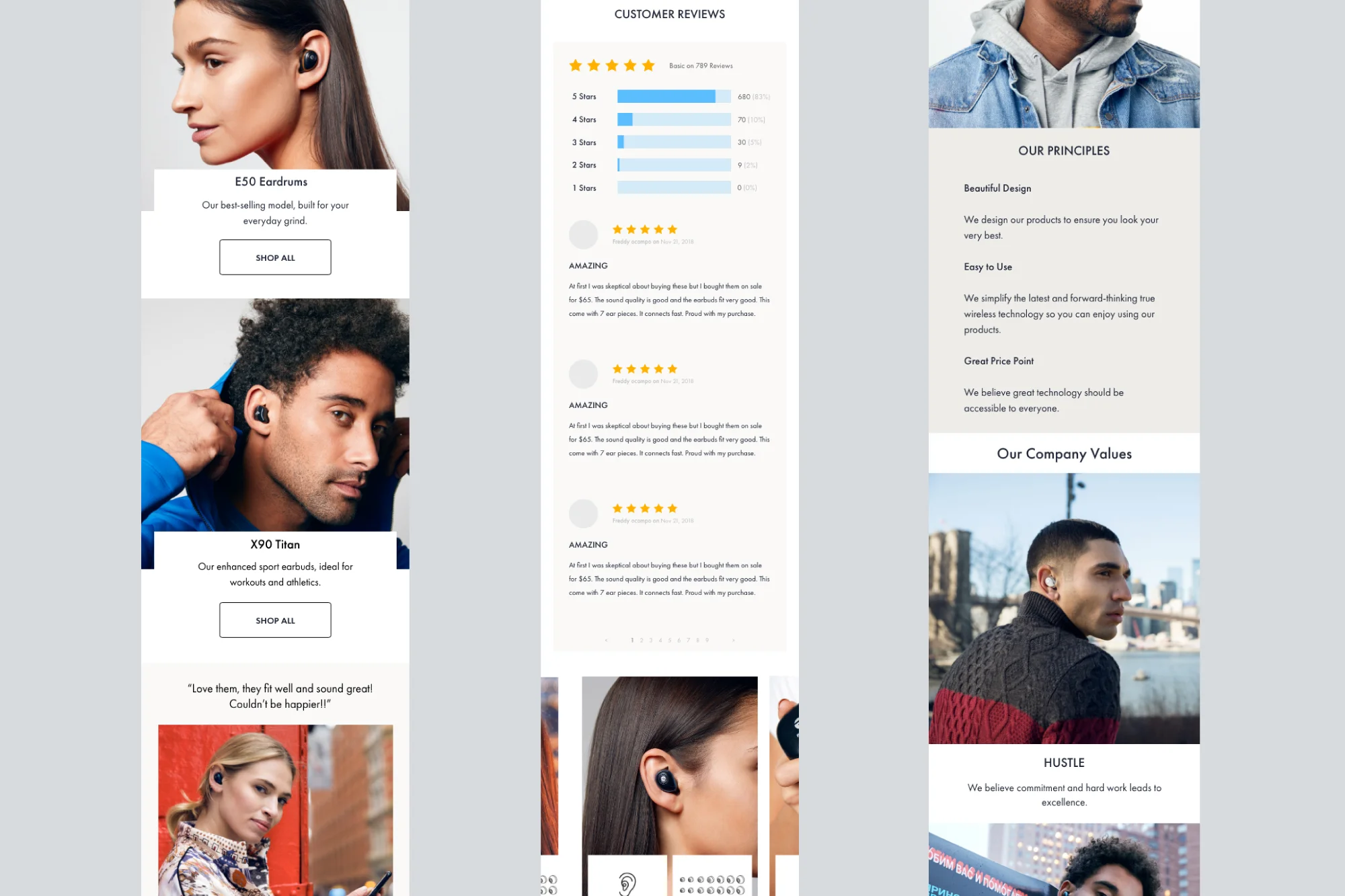
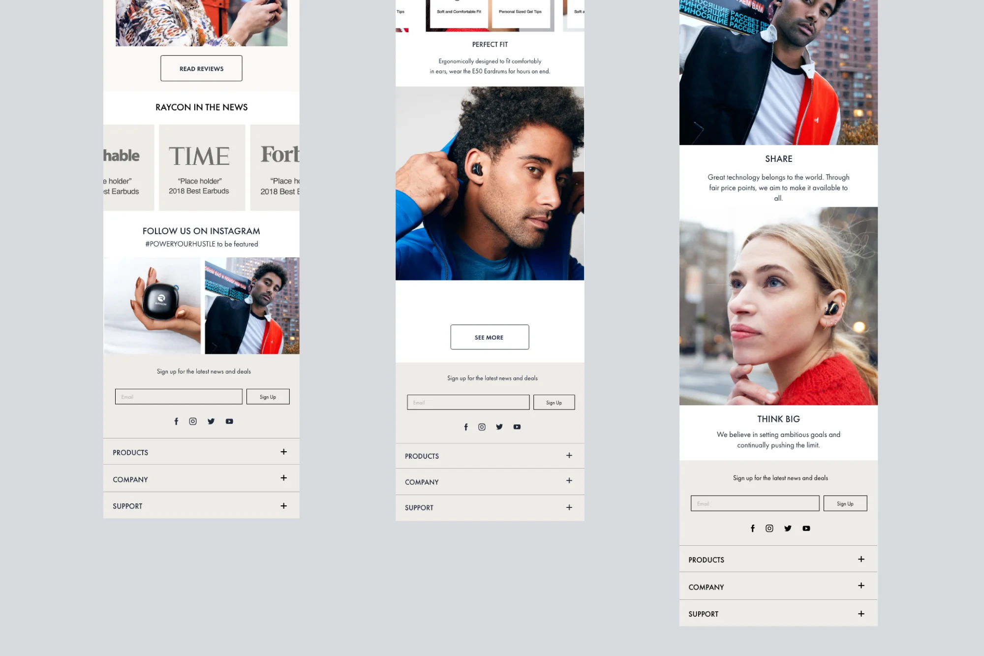
• State the USP very clearly at top of the fold on our homepage
• Social proof (customer and press review quotes)
• Add customer reviews on the landing page
• Feature icons underneath the product page
• Lifestyle photos to lead people to BOFU instead of generic product photos